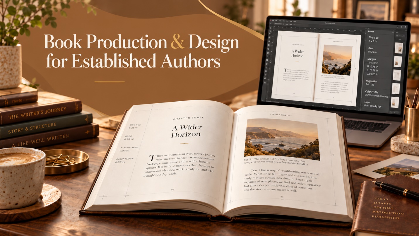
An author can spend months getting a manuscript ready for publishing, and they still end up with a book that feels unfinished once it reaches the final stage of publication.
This problem usually has less to do with the writing process than with production. The most common issues authors face are cramped margins, inconsistent chapter openings, page numbers appearing out of order or in places where they shouldn’t, images sitting too close to the trim line, and so on. None of these problems sounds dramatic until readers start noticing the end result.
When book formatting is done well, most people never think about it; they simply read. But when it isn’t done right, they notice, and they judge your book as unprofessional.
Book formatting covers much more than font choice. It involves selecting a suitable page size, appropriate line spacing, engaging chapter openings, neat headers, pagination, aligned images, front matter, and so on. All of these matter when the final file is exported as the finished book.
Apart from formatting, there is also a technical side to getting your book’s final file right. Amazon KDP has specific requirements for the final trim size, bleed, and margins of your book, and a file that falls outside these requirements can run into problems during upload or printing.
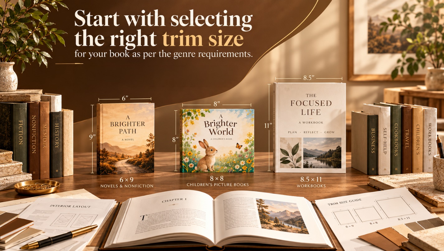
Step 1: Start by selecting the right trim size for your book as per the genre requirements
The trim size of a printed book is simply its finished width and height, but it can change the page count, production cost, spine width, and how the book feels in the reader’s hands.
The most common paperback size in the United States is 6 x 9 inches, as per the KDP formatting guide. It is common because it works well for many novels and nonfiction books, but 6 x 9 should not become your automatic choice when formatting the final draft of a book.
Every book has a genre, and every genre has a specific page size that complements its content. For example: if you’re writing a generic romance novel or a non-fiction book, your best choice could be 6 x 9, but if it’s a children’s picture book, a workbook, or a straightforward novel, then the page size must vary according to the content of the book.
A children’s picture book needs space for artwork, so the best page size for this kind of content would be 8 x 8. A workbook may need wider pages so readers can write comfortably, so the suitable page size would be 8.5 x 11, and a straightforward novel can usually be more compact.
Experienced and professional book interior design starts with the content and works outward. The page dimensions, type size, spacing, and layout should make sense for that particular book.

Step 2: Sort out the bleed and margins of the book early
Bleed and margins are easy to ignore while a book is still being written, but once designing or formatting begins, they matter a great deal to the final appearance of a printed book.
Bleed is an extra background area that extends beyond the final trim line on the margin of the page, used when the page has additional illustrated or visual content. If you have set a bleed, the printer can cut away the excess area while printing; without enough bleed, artwork that is supposed to reach the edge of the page can leave a thin white strip after trimming.
For a full-bleed interior, KDP requires 0.125 inches of bleed on the top, bottom, and outside edges for pages that need it. Adding bleed can change the inside margin of the pages, as well as the page count, because thicker books need more room near the binding than normal text-only books. Like KDP, Ingram Spark also uses 0.125 inches of bleed on the top, bottom, and outside edges. It also recommends keeping non-bleeding material at least 0.5 inches away from the final trim edge.
Correcting a complex book interior after hundreds of pages have already been designed can turn into an exhausting job. That’s why these measurements are very important, especially when a book contains photographs, illustrations, tables, decorative chapter pages, or content that comes close to the edge.
Formatting a text-only novel can be quite straightforward, but formatting a heavily illustrated book is another matter. This is where professional book formatting services often become more useful.
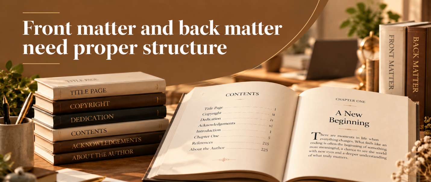
Step 3: Front matter and back matter need proper structure
Before readers reach Chapter One, they may already have passed through several pages known as front matter.
The sections that come before and after the main content of a book are known as front matter and back matter. They include the title page, copyright information, dedication, table of contents, acknowledgements, references, trigger warnings, some illustrations if needed, the author bio, a glossary, or details about other books written by the author. Which of these sections belong in the front matter or back matter depends on the content of the book.
A text-only novel or nonfiction book does not require the same formatting style as a heavily illustrated manuscript, but the designer should always make sure that the order of the content feels logical and that the formatting style suits it.
Even if a manuscript is designed beautifully, it can still look unprofessional if the copyright page uses a different font, the contents page looks out of place, or the acknowledgements look like they’ve been added at the last minute.
In such situations, KDP’s formatting guidelines help by covering front matter, chapters, pagination, headers, images, and table of contents preparation before the PDF is exported as a fully completed, print-ready file.
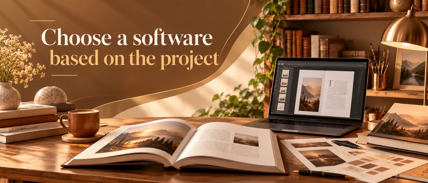
Step 4: Choose software based on the project
Not every author can rely on a single formatting program that suits the genre or content of their book.
For text-only novels and other straightforward books, Vellum and Atticus can be exactly what an author needs. These are among the most popular formatting programs because they make it relatively easy to produce print and e-book editions without having to build every page manually.
If a project’s layout requirements are more demanding, Adobe InDesign can be useful. It gives designers detailed control over the typography, graphics, page dimensions, color, bleed, and printed output of the book. Adobe also includes tools designed specifically for longer books and multi-document projects. This gives you extra control, but it comes with a steeper learning curve and offers little benefit in turning a simple novel into a complicated production plan when a lighter tool can handle it perfectly well.
An illustrated memoir, photography title, workbook, or design-heavy nonfiction book is different, because these projects often require the finer control that professional layout software provides.
Step 5: Do not stop working at the exported PDF file
A successfully exported PDF file might feel complete, but this is where self-published book formatting sometimes goes wrong, because it is still not quite finished. For a manuscript to be perfectly ready for publishing and printing, the final PDF file should contain the entire interior of the book as single pages, use the correct dimensions, and include properly embedded fonts.
Platforms like Ingram Spark require authors and publishers to submit one complete interior PDF file rather than separate files for individual chapters. It also recommends 300 pixels per inch for continuous-tone images.
After making sure all this is set, order an author proof copy, because screens can be useful for catching obvious mistakes, but printed paper helps in catching every tiny detail that a screen ignores.
Common formatting issues are much easier to identify and fix when you’re holding the physical book in your hands rather than staring at a monitor. A gutter margin that looks acceptable on a monitor can feel cramped once the pages are bound, an image that is perfectly aligned and tinted on the monitor may appear darker in print, and a heading might sit awkwardly at the bottom of a page even though nothing is technically wrong with it.
Along with the formatted content, metadata needs a final check as well. Bowker is the official ISBN agency in the United States. It handles the metadata associated with publication and ISBN records, including the book title, author, description, pricing, and other publishing details.
Step 6: Good production lets the book get out of the way
A book can rarely grab its readers’ attention despite having the best formatted or designed interior. Things like readers finding chapters easily, a comfortable and easy-to-read font, images sitting where they belong, and balanced pages are the key to grabbing readers’ attention. Nothing pulls the reader out of the book more than a misaligned heading that looks slightly out of place, a margin that looks different from the other pages, or a font that suddenly becomes harder to read.
For established authors, professional production is part of finishing their manuscript properly before sending it for publication and printing. Book formatting should support the writing rather than compete with it.
Whether a designer uses a program like Vellum, Atticus, Adobe InDesign, or any other professional book formatting service, what matters is that the printed book feels intentional when someone finally opens it.